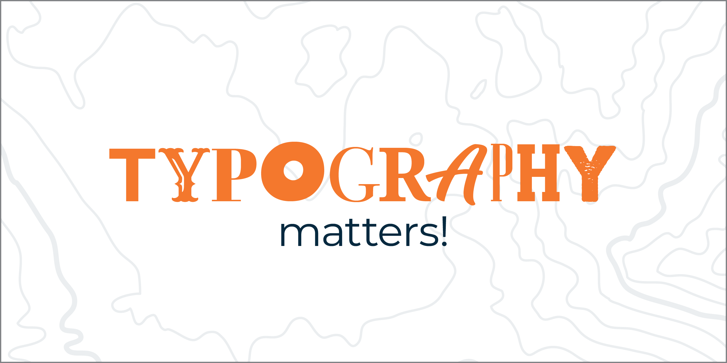
Let me introduce you to a critical aspect of your brand: typography! “What is typography?” you ask?
Typography is the style and appearance of written material. And yes, it matters.
For a lot of companies, the amount of thought that goes into their typographic choices extends to the default fonts on their chosen website templates. And if those companies are going to be really strategic, they’ll find out what those fonts are and use them in the rest of their marketing material (although most people don’t get this far).
A majority of companies, however, will settle for about 15 different font choices being used throughout all of their marketing platforms. Why is this a problem? Let me remind you of the importance of brand consistency. If your company is going to maintain its visual integrity across every platform, then you absolutely must pay attention to your typography – and orchestrate it so that it further articulates your company’s personality.
TYPOGRAPHY REPRESENTS YOUR COMPANY’S PERSONALITY
It would be easy to think that typography doesn’t really matter and that “it’s just for those graphic design nerds”. But it really should matter to you if you’re trying to build a cohesive, on-mission brand.
Typographic choices are just one area through which your company’s personality gets fleshed out.
Do you want your brand to be relatable and approachable? Try using (sparingly) a handwritten typeface (the fancy designer word for a specific font choice within a font family):

Do you want your company to appear high-end and luxury? Try a tall, thin, sans-serif typeface in all caps:

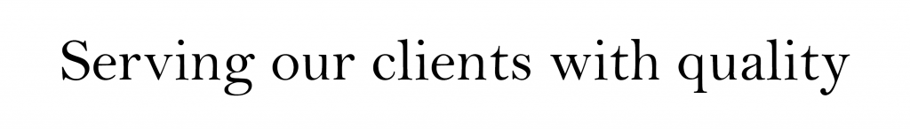
Does your company wink at antiquity and a long history? Try using an established “book-ish” serif typeface:
Do you see how each of these examples drastically change the message of what’s written, just by adding a visual layer of interpretation? (In real branding, we would also accompany these font choices with color and some design styles to add an even deeper level of meaning.)
IT NEEDS TO BE CONSISTENT
As with everything else that we ever talk about, constancy is key! Once you (or your brand designer) establishes your company’s chosen typography, as much as it’s within your power, don’t stray from it. It might not be possible to use your font choices 100% of the time (there are certain channels that are limiting with regards to this, such as websites and emails), but when you can, always use your brand’s fonts. Being consistent with your font use familiarizes your clients with who you are, building trust and loyalty.
LIMIT YOUR FONT CHOICES
Yes, there are lots of cool fonts out there, we understand. But please, to keep your designer (and clients) sane, don’t use them all! Following the general rule of brand consistency will tell you that less is more – it’s difficult to be consistent if you’re using a million different fonts as opposed to two or three good ones. And, let’s face it, scrolling through a web page, for instance, that uses 7 different fonts, is confusing and looks rushed and messy. We recommend choosing two main fonts, with a max of three if your third is a decorative font that is used very sparingly.
Your font choices should be strategic. The process of choosing yours should involve time and effort, and the fonts you end up with should be representative of your brand’s personality.
If you’d like help assessing your current font choices, or taking the time to choose new fonts going forward, please reach out to us!
Recent Comments